The Loyalty Dashboard Explained: Revenue, Lifetime Value, and Retention Metrics in One Place
See exactly what the WeLoyal dashboard shows: real revenue tied to loyalty, per-customer lifetime value, redemption stats, and membership metrics, with no spreadsheets.
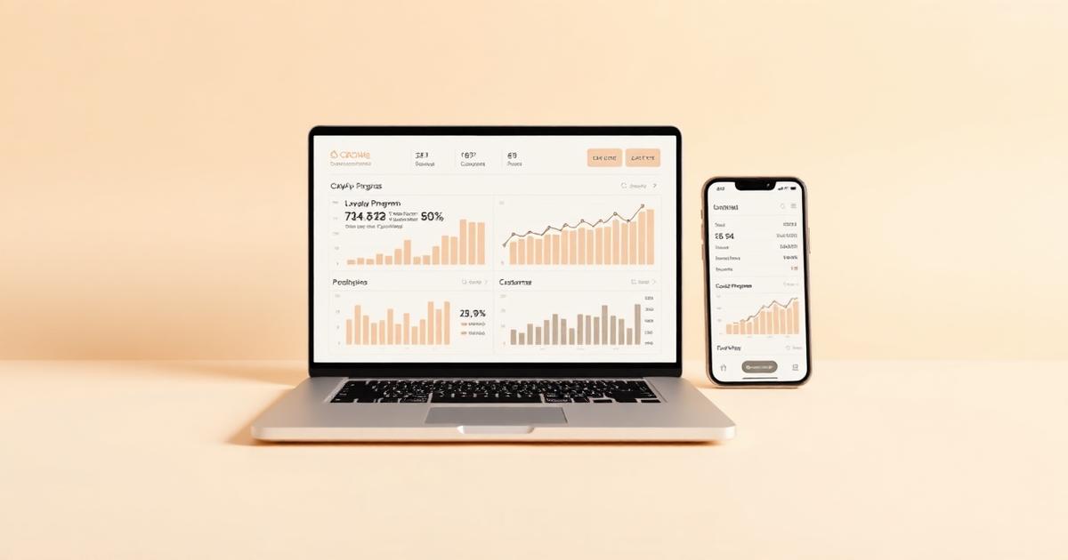
WeLoyal is a digital loyalty card platform that gives every business a real analytics dashboard behind its loyalty cards, showing exactly how much revenue is being generated, which customers are the most valuable, and how the program is performing over time, without requiring any spreadsheet work or manual tracking. A loyalty program that a business can't actually measure is really just an assumption dressed up as a strategy, and one of the most meaningful advantages of running loyalty through a digital wallet card rather than a paper or plastic alternative is that every single interaction generates real, structured data automatically. This post walks through exactly what a business owner can actually see on the dashboard behind their cards, and how to read those numbers to make genuinely better decisions.
Why a dashboard exists at all, and what it replaces
A paper punch card generates precisely zero usable data. A business has no reliable way of knowing how many cards are actually in circulation, how many have been fully redeemed, or which customers are the ones actually driving repeat visits versus which ones took a card and never came back. Any sense a business owner has of "who our regulars are" tends to be built on memory and gut feeling, useful, but inherently limited and impossible to verify.
A digital loyalty card changes this completely, because every scan, every stamp, every point earned or redeemed, and every membership payment processed gets recorded automatically the moment it happens. None of this requires a business owner to manually log anything, the data simply accumulates as a natural byproduct of the loyalty program actually being used, and the dashboard's job is to take that raw activity and turn it into something genuinely useful to look at.
Revenue tracking: seeing what the program is actually contributing
At the most fundamental level, the dashboard shows real revenue figures tied directly to loyalty activity, not an estimate, but actual purchase amounts recorded at the point of each transaction. This lets a business see, in concrete terms, how much revenue is flowing through customers who are part of the loyalty program, and for businesses running purchase-based mechanics like cashback or stamp cards tied to spend, exactly how that revenue breaks down over whatever time period the business wants to look at, a week, a month, a full year.
This matters because it turns loyalty from a program a business hopes is working into one it can actually verify is working, with real numbers rather than an impression. A business can look directly at whether revenue tied to loyalty members is trending upward, flat, or declining, and adjust its approach accordingly rather than continuing to run a program on autopilot without ever checking whether it's actually contributing anything.
Customer-level lifetime value, visible for every individual customer
Beyond aggregate revenue, the dashboard breaks lifetime value down to the level of a single, specific customer. For any customer who's installed a card, a business can see exactly how much that person has spent since joining, how frequently they've visited, and how their engagement has trended over time. This individual-level visibility is genuinely difficult to achieve through any other method available to a small business, since it would otherwise require manually tracking every single customer's purchase history by hand, which simply isn't realistic once a customer base grows beyond a small handful of names.
Seeing this at the individual level lets a business identify its actual top customers with certainty rather than guesswork, the specific handful of people responsible for a disproportionate share of repeat revenue, and treat them accordingly, whether that means personal recognition, early access to something new, or simply making sure those specific relationships never get taken for granted.
Redemption and engagement statistics
The dashboard also tracks the operational side of the loyalty program itself, how many cards have been issued in total, how many are actively being used versus sitting dormant, how many rewards have been redeemed, and how quickly customers are typically moving through a stamp card or points cycle from start to reward. This level of detail helps a business understand whether the mechanics of a specific card are actually working as intended. A stamp card where very few customers ever reach the final stamp might signal the reward threshold is set too high, discouraging people before they get anywhere close, information a business would have no way of discovering without this kind of visibility.
Membership-specific metrics for recurring revenue programs
For businesses running a membership card connected to real recurring billing, the dashboard goes considerably further, surfacing the kind of metrics normally associated with dedicated subscription businesses. Monthly recurring revenue shows the predictable baseline income generated by active members before a single walk-in customer ever factors in. Average revenue per user shows how much a typical member is worth on a monthly basis. Churn figures show how many members are cancelling over a given period, and lifetime value calculations specific to membership customers show what a typical member relationship is actually worth once average subscription length is factored in.
A dedicated payments view breaks all of this down further still, with visual trends over a selectable date range covering revenue, active member counts, new members joining, and members who've churned, alongside a raw, detailed transaction table underneath for anyone who wants to look at the individual charges making up those totals. This gives a business running a membership program the same kind of financial visibility a much larger subscription business would expect to have into its own numbers, without needing separate subscription analytics software layered on top.
How to actually read these numbers and act on them
Having access to data is only useful if it actually changes decisions, and there are a few genuinely practical ways business owners tend to use this dashboard in practice. Watching revenue trends over time helps catch a slowly declining program early, well before it becomes an obvious problem. Looking at which specific customers show up at the top of the lifetime value list helps identify who's actually worth extra attention or personal outreach, rather than guessing based on who happens to be memorable. Watching redemption rates on a specific card helps identify whether a reward threshold or a points requirement needs adjusting because too few customers are actually reaching it. And for membership programs specifically, watching churn alongside new member growth month over month gives an early, honest signal about whether the program is genuinely growing or simply treading water while losing members quietly on the back end.
Why this level of visibility used to be out of reach for most small businesses
Analytics at this depth, real per-customer lifetime value, automatic segmentation feeding directly into revenue figures, subscription-style metrics like churn and monthly recurring revenue, has historically been the domain of large companies with dedicated data teams and expensive, purpose-built software. A small café, salon, or gym running a paper punch card or even a basic plastic loyalty card had no realistic path to this kind of visibility into their own customer base. Because a digital wallet card generates this data automatically as a direct byproduct of customers simply using it, that same depth of insight becomes available to any business running the program, regardless of size, without requiring any additional analytics tooling, technical skill, or manual effort to produce it.
At a glance: what the dashboard actually shows
Revenue and program performance:
- Real revenue figures tied directly to loyalty activity
- Trends over any selected time period
Customer-level detail:
- Individual lifetime value for every customer
- Visit frequency and spending trends per customer
- Clear visibility into who the actual top customers are
Program mechanics:
- Total cards issued versus actively used
- Redemption rates and reward completion patterns
- Signals for adjusting thresholds that are set too high or too low
Membership-specific metrics:
- Monthly recurring revenue
- Average revenue per member
- Churn and new member trends over time
- A full transaction-level payments view
Read more
Customer Lifetime Value: What It Means and How a Loyalty Program Actually Increases It
What customer lifetime value means, why it matters more than any single visit, and exactly how a digital loyalty program moves that number in the right direction.

Digital Loyalty Cards for Beauty Salons: Rewarding Your Best Clients and Filling the Chair on Slow Days
How WeLoyal helps beauty salons reward clients by what they spend, sell prepaid treatment packages, and turn gift purchases into new clients across a wide range of services.

Digital Loyalty Cards for Chiropractors: Keeping Patients on Their Treatment Plan
How WeLoyal helps chiropractic and physical therapy practices keep patients consistent with treatment plans, collect for packages upfront, and follow up with drop-offs.